Logo, label, and advertisement concepts for a theoretical beverage company that makes herbal, fruit-forward sparkling water. “Kanso” means “simplicity” or “natural elegance” in Japanese, so I wanted to create a look and energy that embodied this based on my interpretations.


For the can label designs, I used Helvetica for a main font and used images and textures of the flavor ingredients. I wanted the designs to be minimalist and emphasize beauty in simplicity.

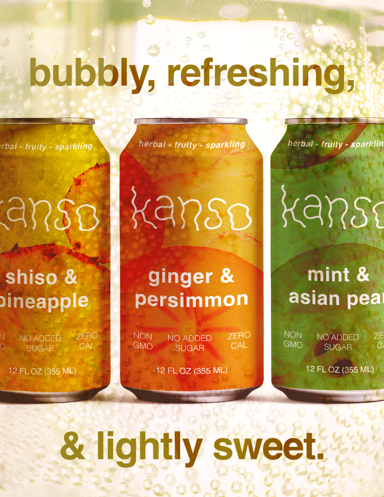

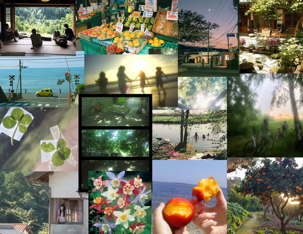
Advertisement concepts. I kept ideas of nature, minimalism, texture, and beauty in simplicity in mind.