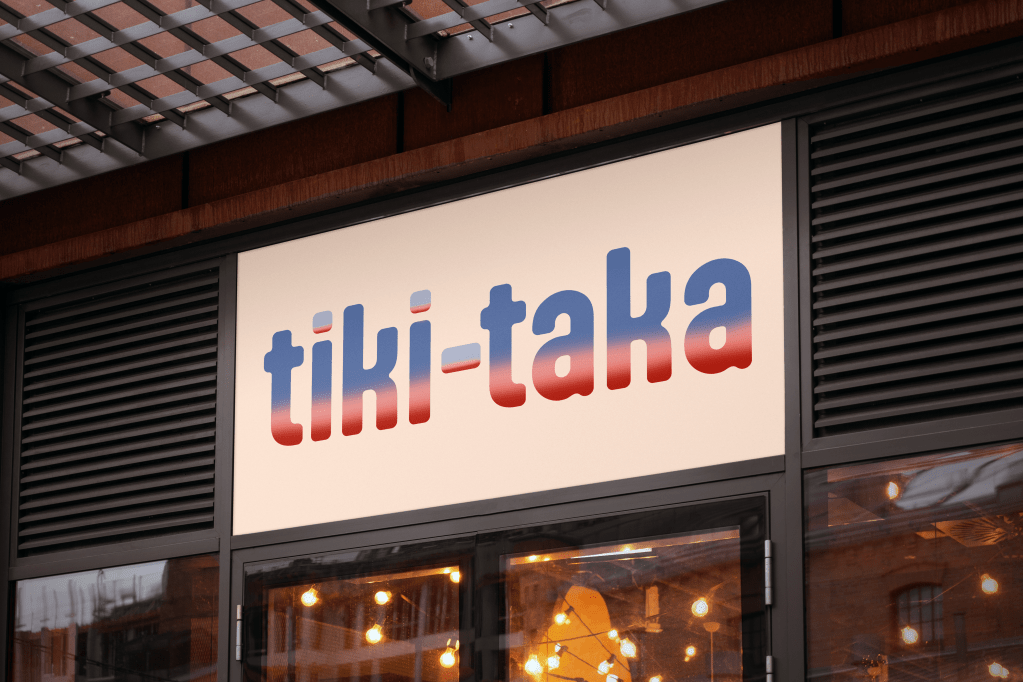
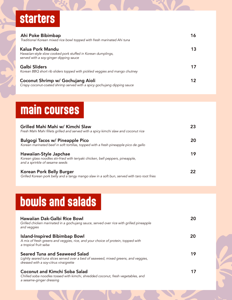
Logo and menu concept for a fake Korean-island fusion restaurant called “tiki-taka”. In Korean, the term “tiki-taka” (티키타카) is used to refer to “good chemistry (in one’s conversation)”. With this in mind, I pictured the restaurant in my head and created a logo and menu for it. It would be sophisticated yet warm and inviting, with good atmosphere and a subtle tropical vibe.
Ideation for logo’s font. I ended up going with the last font, Aptly Bold. I felt like the font was sophisticated while still being friendly with its roundness and weight.Ideation for the logo’s visuals. I ended up going with the third design. It felt slightly upscale while also staying vibrant and enticing.More ideation for the logo’s visuals. With these, I leaned more into the tropical island and Korean aesthetic. However, I felt like they were not subtle enough.